


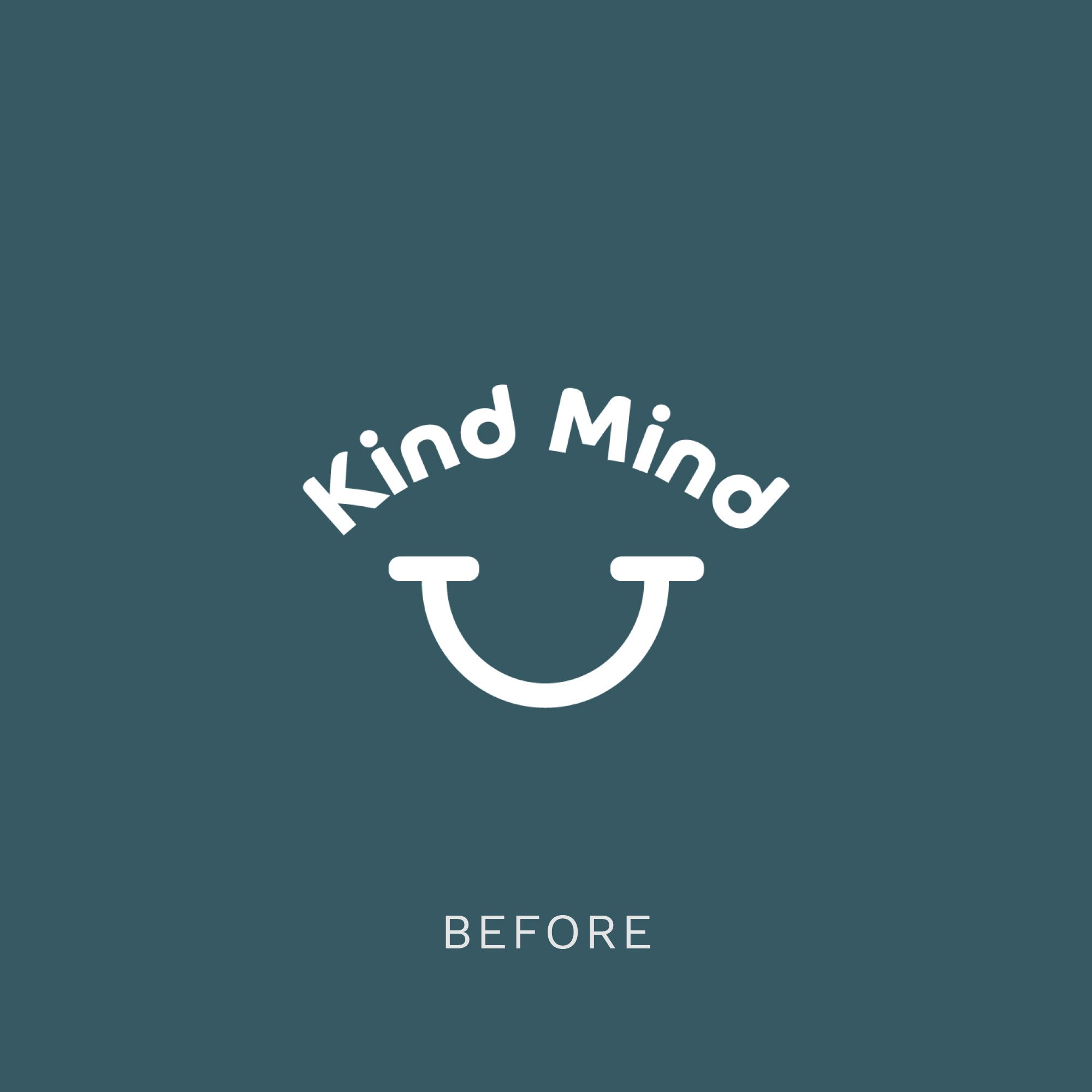
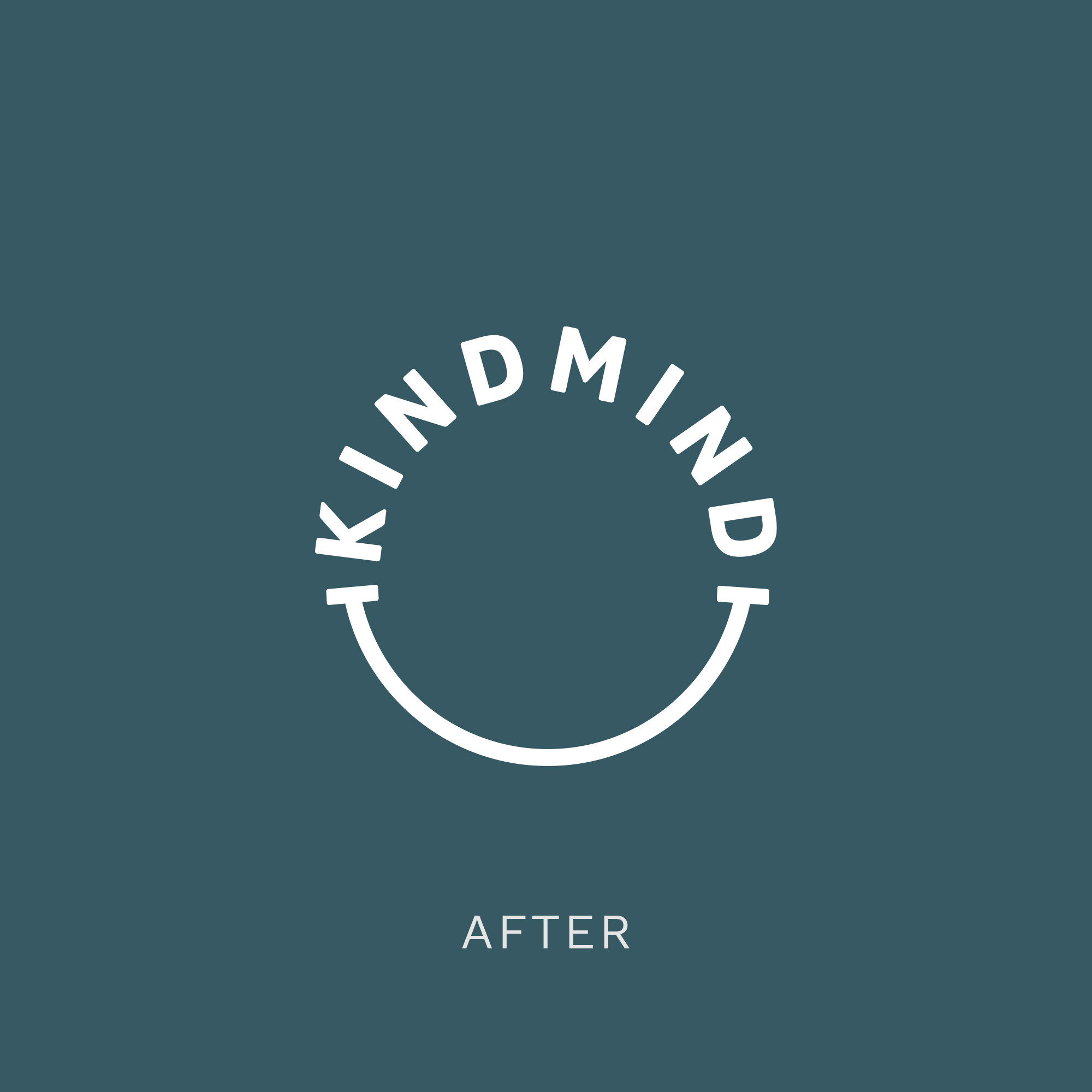
“The existing brand concept was good, the combination of rounded letters and the smile device was soft and warm, but a little too playful. We sharpened the lines and adjusted the shape and relationship of the lockup to create a bold roundel.”


“You can read about the full project here”

